

Why Your SEO Data Needs a Central Command Center
A data studio seo dashboard is a centralized reporting interface that connects multiple data sources (Google Search Console, Google Analytics 4, rank tracking tools) into one visual display, allowing you to monitor organic traffic, keyword rankings, CTR, impressions, and conversions in real-time without manual data compilation.
Key components of an effective SEO dashboard:
- Data Sources – Google Search Console, GA4, third-party SEO tools
- Essential Metrics – Organic clicks, impressions, CTR, average position, keyword rankings
- Visualizations – Scorecards, time series charts, tables, geo maps
- Custom Fields – Calculated metrics like ranking tiers, conversion rates, traffic trends
- Sharing Options – Client access, automated reports, white-label branding
For as long as SEO professionals have tracked performance, they’ve struggled with data scattered across multiple platforms. You log into Google Search Console to check impressions, switch to Analytics for conversion data, then jump to a rank tracker for position changes. By the time you compile everything into a spreadsheet, hours have vanished, and your data is already outdated.
This is where Looker Studio (formerly Google Data Studio) becomes essential. It’s a free visualization tool that pulls data from 1,000+ sources into live, interactive dashboards. Instead of copying numbers between tools, you connect your data sources once and watch your metrics update automatically. The platform transforms raw SEO data into clear visual stories that both you and your clients can understand at a glance.
The shift from manual reporting to automated dashboards isn’t just about saving time, it’s about uncovering insights you’d otherwise miss. When all your SEO data lives in one place, you spot patterns faster. You see which landing pages are losing traffic, which keywords are climbing rankings, and where your optimization efforts are actually paying off. You can track brand versus non-brand performance, identify keyword cannibalization issues, and measure the exact impact of technical fixes.
But building an effective SEO dashboard requires more than connecting a few data sources. You need to know which metrics actually matter, how to structure visualizations for clarity, and how to blend data from multiple platforms without creating confusion. Many businesses start with basic templates only to find they’re missing critical insights or drowning in irrelevant data.
At SiteRank, we’ve spent years building data studio seo dashboards that focus on the metrics that drive real business outcomes and present them in ways that spark action. This guide will walk you through creating a dashboard that doesn’t just look good, it helps you make better SEO decisions faster.
Benefits and Essential Metrics for SEO Reporting
In the world of SEO, making data-driven decisions is paramount. A well-crafted data studio seo dashboard is our secret weapon for achieving this, offering numerous advantages over traditional, manual reporting methods.
Centralized Reporting
Imagine having all your crucial SEO data—from organic traffic numbers to keyword rankings and conversion rates—in one accessible place. That’s the power of centralized reporting with Looker Studio. Instead of toggling between Google Analytics, Google Search Console, and various rank trackers, we can consolidate all this information into a single, comprehensive view. This eliminates the tedious process of pulling data from disparate sources, allowing us to spend less time on data compilation and more time on strategic analysis.
Real-Time Insights
One of the most significant advantages of using Looker Studio for our data studio seo dashboard is the ability to access real-time insights. Once connected, our dashboards automatically refresh, ensuring that the data we’re viewing is always up-to-date. This real-time visibility means we can quickly identify trends, react to performance changes, and make agile adjustments to our SEO strategies. It’s like having a live pulse on our website’s performance, enabling us to stay ahead of the curve. You can learn more about Looker Studio’s capabilities by checking out the Looker Studio Overview.
Scalability
For SEO professionals and agencies, scalability is a game-changer. Whether we’re managing a handful of clients or dozens, Looker Studio dashboards allow us to replicate successful reporting structures with ease. We can create a “model” dashboard and then clone it for each new client, customizing it with their specific data sources and branding. This saves hundreds of hours in setup and reporting time, making our processes incredibly efficient and allowing us to manage growth without increasing manual workload. This efficiency is critical for delivering top-notch SEO Marketing Services Online.
Client Transparency
Transparency is key to building trust with clients. A data studio seo dashboard provides an interactive, easy-to-understand view of SEO performance, making it simple to communicate value and progress. Clients can be given access to live dashboards, allowing them to see the impact of our efforts whenever they want. This fosters better communication, eliminates confusion, and helps clients understand exactly what’s working and why. Our dashboards become powerful data storytelling tools, showcasing improved search visibility and campaign effectiveness.
Essential SEO Metrics and KPIs
To truly understand our SEO performance, our dashboards must include a core set of metrics and Key Performance Indicators (KPIs). These are the building blocks of any effective data studio seo dashboard:
- Organic Clicks: The number of clicks from organic search results. This tells us how many users are visiting our site directly from Google.
- Impressions: How many times our website appeared in search results. This metric indicates our visibility and reach.
- Click-Through Rate (CTR): The percentage of impressions that result in a click. A high CTR suggests our titles and meta descriptions are compelling.
- Average Position: Our average ranking position for various keywords. This helps us gauge our visibility in the SERPs.
- Landing Page Performance: Analyzing which pages receive the most organic traffic, their engagement rates, and how they contribute to conversions.
- Keyword Rankings: Tracking the position of our target keywords over time. While Google Analytics doesn’t show all keywords, combining data sources helps us recover much of this crucial information.
- Technical SEO Health: While not directly a metric in GA/GSC, dashboards can incorporate data points like Avg. Document Interactive Time and Avg. Page Load Time from Google Analytics to monitor site speed, an important aspect of Technical SEO.
Here’s a quick comparison of key metrics typically found in Google Analytics 4 (GA4) versus Google Search Console (GSC):
| Metric | Google Analytics 4 (GA4) | Google Search Console (GSC) |
|---|---|---|
| Traffic Volume | Users, Sessions, Engaged Sessions | Clicks, Impressions |
| User Behavior | Engagement Rate, Bounce Rate, Average Session Duration | CTR (Click-Through Rate) |
| Visibility | (Indirectly through traffic sources) | Impressions, Average Position |
| Keyword Data | (Limited, often “not provided” for organic keywords) | Queries (search terms), Landing Pages |
| Conversions | Custom Events, Goal Completions | (No direct conversion tracking, but shows clicks to pages) |
| Historical Data Limit | Up to 14 months (for GSC reports within GA) | 16 months |
By blending these data sources, we get a holistic view that each tool alone cannot provide.
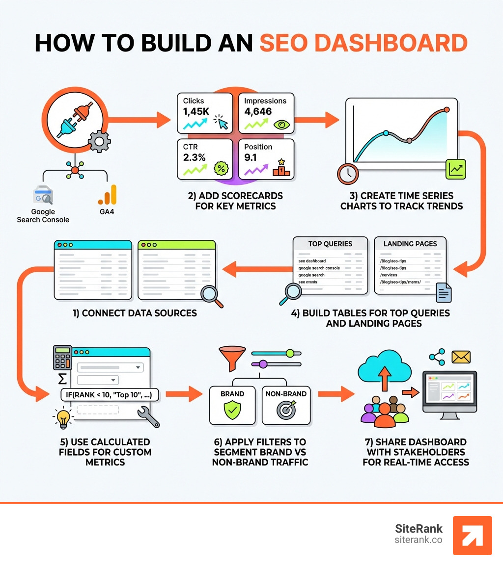
Step-by-Step Guide to Building Your Data Studio SEO Dashboard
Building a data studio seo dashboard from scratch might seem daunting, but with a structured approach, it becomes a straightforward process. Let’s explore the practical steps.
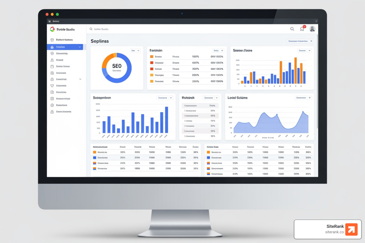
First things first, we need to access the platform. Steer to Log in to Looker Studio and sign in with your Google account. Once you’re in, you’ll want to start a new, blank report. This is our canvas for creativity!
Looker Studio offers nearly 500 different “connectors” to import datasets. For SEO, our primary data sources will typically be Google Search Console and Google Analytics 4. These two tools provide the foundational data we need to understand organic performance.
Connecting Data Sources to Your Data Studio SEO Dashboard
The magic of Looker Studio begins with connecting your data. This process is surprisingly simple:
- Start a New Report: From the Looker Studio homepage, click on “Blank report” or “Create” > “Report.”
- Add Data to Report: You’ll be prompted to “Add data to report.” Here, you’ll see a list of Google connectors and partner connectors.
- Connect Google Search Console:
- Search for and select “Google Search Console.”
- Authorization: If it’s your first time, you’ll need to authorize Looker Studio to access your Search Console data.
- Property Selection: Choose the Search Console property you want to analyze (e.g., your website’s domain property).
- Table Selection: You’ll typically choose between “Site Impressions” (overall site data) and “URL Impressions” (page-specific data). For a comprehensive SEO dashboard, we often connect both as separate data sources.
- Web/Image/Video: Select “Web” for standard organic search data.
- Click “Add” to complete the connection.
- Connect Google Analytics 4 (GA4):
- Search for and select “Google Analytics.”
- Authorization: Authorize if prompted.
- Account, Property, and Data Stream: Select your GA4 account, then the specific property, and finally the data stream (e.g., your website’s web stream).
- Click “Add” to complete the connection.
We might also connect data from other sources, such as Google Business Profile (for local SEO), Google Sheets (for manual keyword tracking or aggregated data), or other tools via partner connectors. For example, if we’re doing extensive Keyword Research and storing that data in a Google Sheet, we can easily pull it into our dashboard.
Visualizing Performance in Your Data Studio SEO Dashboard
Once our data sources are connected, it’s time to bring our data to life with visualizations. Looker Studio offers a wide array of chart types, each serving a unique purpose in data storytelling.
- Scorecards: These are perfect for displaying key performance indicators (KPIs) at a glance. Think total clicks, total impressions, average CTR, or current average position. We typically place these prominently at the top of our dashboards for a quick overview of performance.
- Implementation: Click “Add a chart” > “Scorecard.” Select your data source and then drag and drop the desired metric (e.g., Clicks from GSC) into the “Metric” field.
- Time Series Charts: Essential for tracking trends over time. We use these to visualize organic traffic fluctuations, impression trends, or average position changes month-over-month or year-over-year.
- Implementation: Click “Add a chart” > “Time series chart.” Set “Date” as your Dimension and a metric like “Clicks” or “Impressions” from GSC as your Metric.
- Tables: Ideal for detailed breakdowns, such as top-performing keywords, landing pages, or queries. Tables allow us to dive deep into specific data points.
- Implementation: Click “Add a chart” > “Table.” Add dimensions like “Query” and “Landing Page” from GSC, and metrics like “Clicks,” “Impressions,” and “Average Position.”
- Geo Charts: Useful for visualizing geographic performance. If we’re targeting specific regions or have a local SEO strategy, a geo chart can show us where our organic traffic is coming from.
- Implementation: Click “Add a chart” > “Geo chart.” Use “Country” or “Region” as your Dimension and “Users” or “Sessions” from GA4 as your Metric.
- Pie Charts: Great for showing proportions, such as traffic distribution by device type (mobile, desktop, tablet) or the breakdown of new versus returning users.
- Implementation: Click “Add a chart” > “Pie chart.” Set “Device Category” from GA4 as your Dimension and “Users” as your Metric.
When arranging these visualizations, we often organize our dashboard into logical sections, such as “Overview,” “Traffic Analysis,” “Keyword Performance,” and “Conversion Tracking.” This makes the dashboard easy to steer and understand for anyone viewing it, whether it’s us or a client. For example, a table showing top-performing landing pages is a great way to highlight our On-Page SEO efforts.
Advanced Techniques: Data Blending and Calculated Fields
To open up the true power of a data studio seo dashboard, we often need to go beyond basic visualizations and dive into advanced techniques like data blending and calculated fields. These features allow us to create custom metrics and derive deeper insights that aren’t available out-of-the-box.
Data Blending for Comprehensive Insights
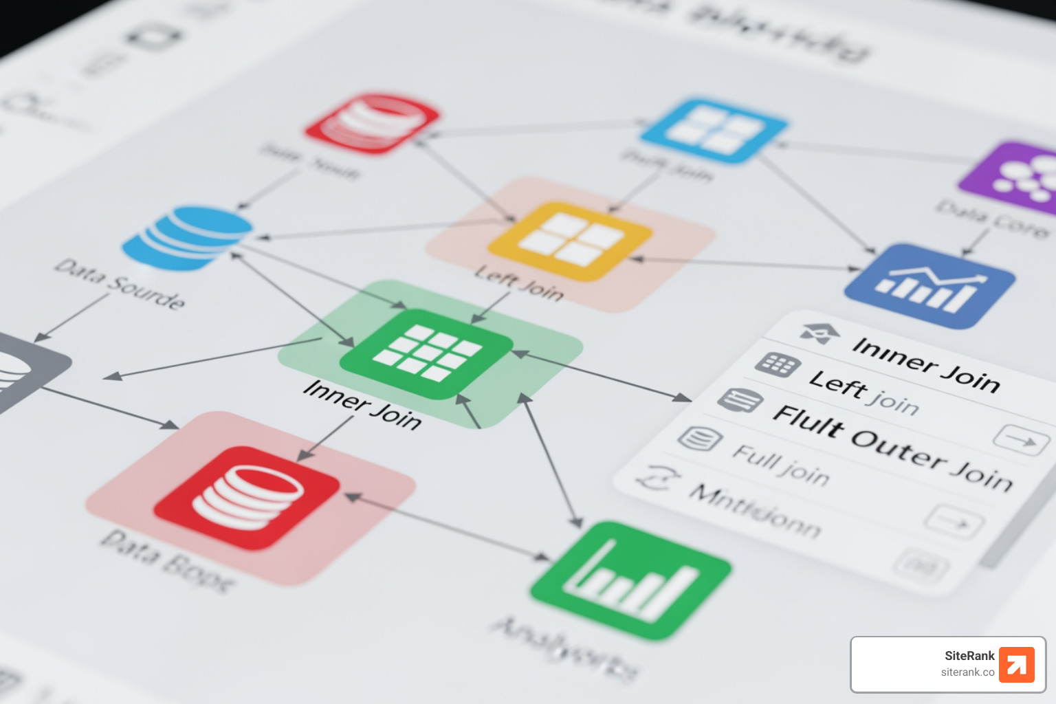
Data blending is the process of combining data from two or more data sources into a single chart or table. This is incredibly powerful for SEO because it allows us to merge, for instance, Google Search Console data (impressions, clicks, queries) with Google Analytics 4 data (user behavior, conversions) to get a more complete picture.
When blending data in Looker Studio, it’s crucial to understand that it operates as a left outer join. This means that the resulting blended table will be based on the records of the first data source you add to the blend. So, if we blend GSC data with GA4 data, and GSC is the “left” table, the resulting data will include all records from GSC and matching records from GA4. Any GSC records without a match in GA4 will still appear, but with null values for the GA4 metrics. Conversely, GA4 records without a GSC match will not appear. This peculiarity of blending is important to keep in mind when structuring your blends to ensure you’re getting the data you expect.
Real-world blending use cases:
- Keyword Cannibalization: By blending GSC data (Query, Landing Page) with our internal content database (via a Google Sheet), we can identify instances where multiple pages are ranking for the same keyword, potentially diluting our organic performance. This helps us optimize our content strategy to ensure each keyword is targeted by a single, authoritative page.
- Keyword-Level Conversions: Since Google Analytics often shows “(not provided)” for many organic keywords, blending GSC query data with GA4 conversion data (based on matching landing pages and date ranges) can help us estimate which keywords are driving actual conversions. This provides invaluable insights into the commercial value of our organic traffic.
Calculated Fields for Custom Metrics
Calculated fields allow us to create custom metrics and dimensions using formulas based on our existing data. This is where we can get really creative and tailor our dashboards to answer very specific business questions.
Examples of calculated fields for SEO:
- Ranking Tiers: We can create custom metrics to categorize keywords into “Top 3 Rankings,” “Top 10 Rankings,” or “Top 30+ Rankings” using formulas based on the “Average Position” metric from GSC. For example, a formula for “Top 10 Rankings” might look something like
COUNT(CASE WHEN Average Position <= 10 THEN Query ELSE NULL END). This helps us quickly see how many keywords are performing in critical ranking buckets. - Estimated Clicks: Combining “Impressions” from GSC with an estimated CTR curve (which can be stored in a Google Sheet and blended) allows us to project potential clicks for keywords, helping us prioritize optimization efforts.
- Organic Conversion Rate: If we blend GSC clicks with GA4 conversions, we can create a calculated field to show the organic conversion rate for specific landing pages or query groups.
- Year-over-Year Growth: While GSC has a 16-month data limit, we can use calculated fields to compare current period performance to the same period last year, enabling year-over-year analysis for metrics like clicks and impressions.
Calculated fields can also be used for more granular analysis, such as breaking down the performance of our Link Building campaigns by analyzing changes in referring domains against organic traffic increases.
Frequently Asked Questions about SEO Dashboards
We often get asked common questions about building and using data studio seo dashboards. Let’s address some of the most frequent ones.
Can I use pre-built templates for my dashboard?
Absolutely! Pre-built Looker Studio SEO dashboard templates are widely available and can be a fantastic starting point, especially if you’re new to the platform or need to get a dashboard up and running quickly. Many resources offer these “plug-and-play” templates, designed to integrate with common data sources like GA4 and GSC. You can explore a variety of options in the Google Data Studio templates gallery.
Benefits of using templates:
- Efficiency: They save us valuable time by providing a ready-made structure and pre-configured visualizations. We don’t have to build everything from scratch.
- Best Practices: Templates often incorporate common SEO reporting best practices, ensuring we’re tracking relevant metrics and presenting them effectively.
- Inspiration: Even if we plan to build a custom dashboard, templates can offer great ideas for layout, chart types, and data storytelling.
While templates are a great jumpstart, we always recommend customization. Every website and SEO strategy is unique. We can tailor templates by:
- Connecting our specific data sources.
- Adjusting filters and controls to segment data relevant to our goals (e.g., branded vs. non-branded traffic).
- Modifying visualizations to highlight our most important KPIs.
- Applying our branding (logos, color schemes) to make the dashboard uniquely ours.
How do I track keyword rankings over time?
Tracking keyword rankings over time is a critical component of any data studio seo dashboard. It helps us understand the impact of our optimization efforts and identify opportunities.
- Integrate Rank Tracking Data: While Google Search Console provides average position, it doesn’t offer true keyword-level ranking history in the same way a dedicated rank tracker does. For precise keyword ranking tracking, we typically connect a specialized rank tracking tool (often via Google Sheets or a partner connector) to our Looker Studio dashboard. This provides daily or weekly position data for our target keywords.
- Use Trend Charts: A time series chart is our go-to visualization for showing keyword ranking trends. We plot the “Average Position” for a specific keyword or a group of keywords over a selected period. This clearly illustrates whether our rankings are improving, declining, or remaining stable.
- Define Ranking Tiers: As mentioned in the advanced techniques, we can use calculated fields to categorize keywords into “ranking tiers” (e.g., Top 3, Top 10, Top 30). We then use scorecards or time series charts to show the number of keywords falling into each tier over time. This provides a high-level view of overall ranking performance.
- Comparison Periods: Always compare current ranking performance against previous periods (e.g., month-over-month, quarter-over-quarter, or year-over-year). This contextualizes the data and helps us understand the true impact of our strategies.
- Leverage Historical Data: Be mindful of data limitations. Google Search Console typically provides 16 months of historical data. If we need to track rankings for longer periods, a dedicated rank tracker with a longer data retention policy is essential.
What are the limitations of Looker Studio for SEO?
While Looker Studio is an incredibly powerful and flexible tool, it’s important to acknowledge its limitations, especially when building sophisticated data studio seo dashboards:
- API Quotas: Some connectors, particularly for third-party tools or even Google’s own APIs, have daily query limits (quotas). If our dashboards are very complex, have many charts, or are accessed frequently by many users, we might hit these quotas, causing data to temporarily fail to load. This requires optimization of the dashboard or upgrading API access where possible.
- Data Sampling: When working with very large datasets from Google Analytics, Looker Studio might display sampled data to improve performance. Sampled data is an estimate and might not be 100% accurate, especially for granular analysis. We typically try to adjust our date ranges or filters to avoid sampling where possible, or use unsampled reports from GA directly.
- 16-Month Data Limit for Google Search Console: A significant limitation is that Google Search Console data (which is crucial for organic keyword and impression data) is only available for the past 16 months. This makes long-term year-over-year comparisons challenging beyond that timeframe without supplementing with external data storage.
- Data Discrepancies: Sometimes, data discrepancies can arise when blending data from different sources, or even between Google’s own tools (e.g., minor differences in clicks reported by GSC vs. sessions in GA4). This requires careful data validation and understanding of how each tool defines its metrics.
- Steep Learning Curve for Advanced Features: While basic dashboard creation is intuitive, mastering advanced features like complex calculated fields, sophisticated data blending scenarios, and performance optimization can have a steep learning curve. This often requires dedicated practice and a deeper understanding of data manipulation.
Despite these limitations, we find that Looker Studio’s benefits far outweigh the drawbacks, especially when we implement best practices and understand how to work around these challenges.
Conclusion
Building an effective data studio seo dashboard is more than just a technical exercise; it’s about changing raw data into a compelling narrative that drives action and demonstrates value. At SiteRank, we’ve seen how these dashboards empower businesses to make smarter, faster decisions about their SEO strategy.
By centralizing our data, gaining real-time insights, ensuring scalability, and fostering client transparency, we move beyond simply reporting numbers. We start telling a story about growth, opportunity, and ROI. The ability to blend data from various sources and create custom metrics allows us to tailor our dashboards to the unique needs of each client, focusing on the KPIs that truly matter for their business goals.
We believe that every successful SEO strategy is a data-driven strategy. With a well-crafted Looker Studio dashboard, we can continuously monitor performance, identify areas for improvement, and celebrate successes with clarity and confidence. It’s about taking control of your data and using it as a powerful tool for continuous optimization and strategic growth.
Ready to open up your data’s power and see how a custom SEO dashboard can transform your digital presence? Explore our comprehensive Services at SiteRank, where we specialize in delivering custom SEO strategies that drive increased clicks and engagement.